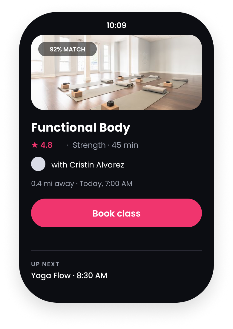
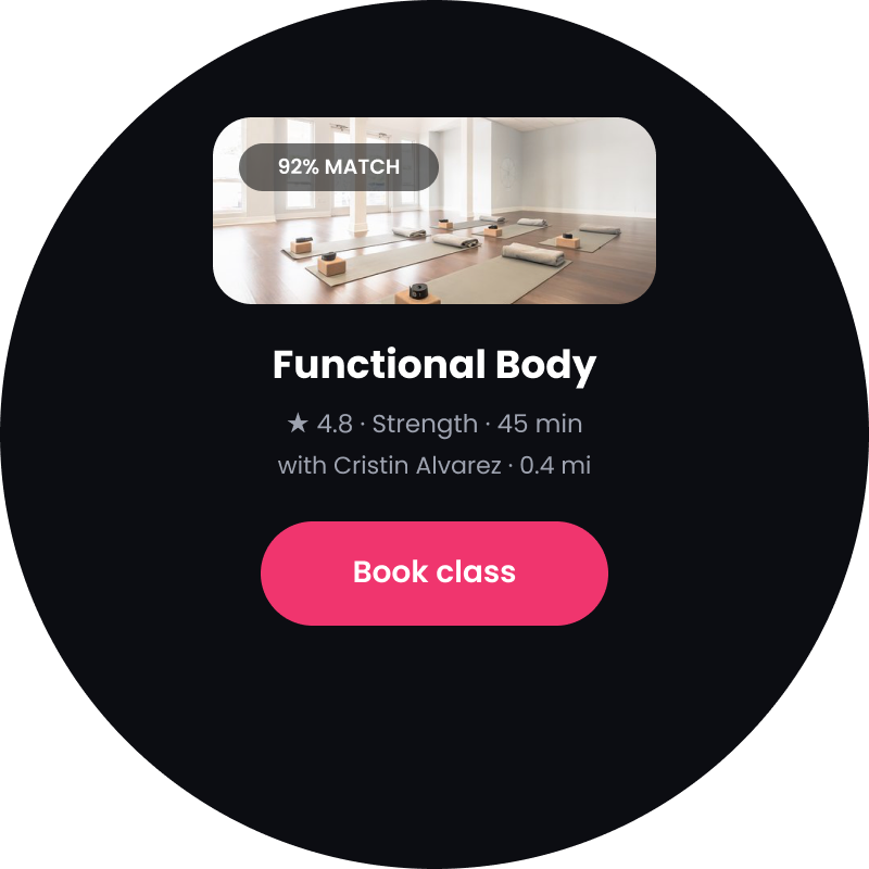
Helping members find classes that fit their lives.
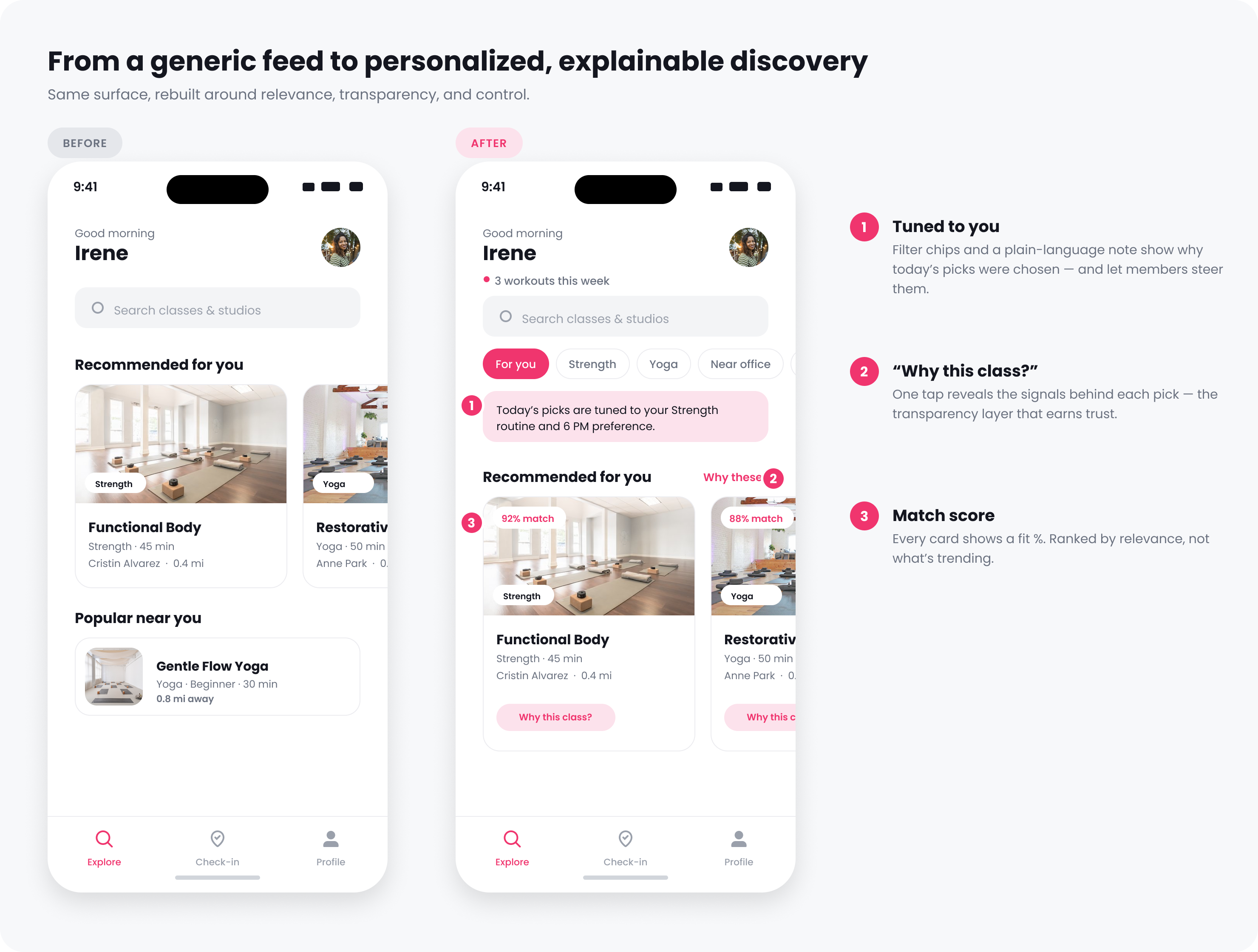
Gympass ranked classes by popularity, so everyone nearby opened the app to the same feed. That one popular list could be too intense for a low-intensity yoga regular and too basic for an experienced runner. I redesigned class discovery around each member's goals, experience, and schedule, then added a clear reason and controls to every recommendation.
Popular classes were often the wrong classes.
Gympass gives employees access to nearby gyms, studios, trainers, and classes. Bookings were falling after New Year, and the team's first explanation was seasonality. Before changing the product, I wanted to check whether members were losing interest or simply failing to find something worth booking.
A quick product primer
What Gympass is
A corporate wellness benefit. Employees get access to thousands of gyms, studios, and fitness classes through their employer, all in one app.
Where people choose a class
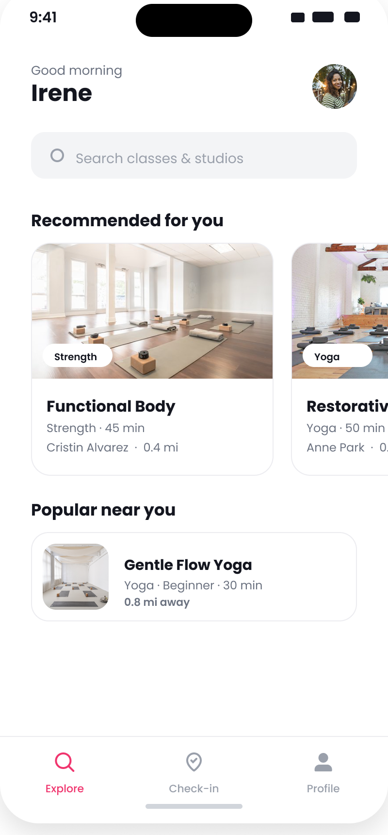
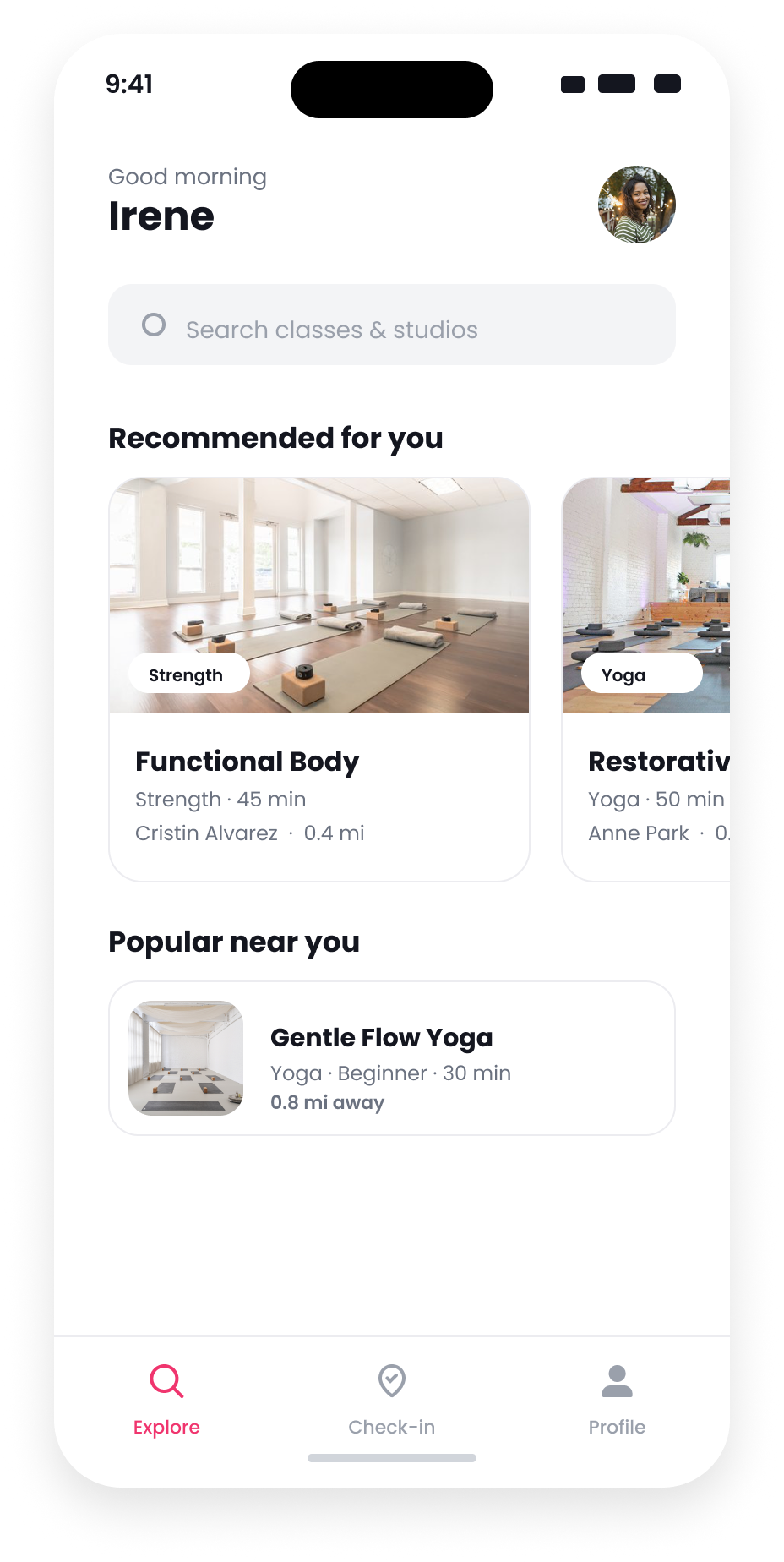
The home feed is the main place members browse and decide what to book.
What was missing
The catalog was large enough. Members needed help finding classes suited to their level, goals, and schedule.
What members saw
The feed showed the same popular classes to everyone nearby. It did not account for experience, goals, or past bookings, and it did not explain why a class appeared. If CrossFit was popular in your area, it ranked first for a low-intensity yoga regular and for everyone else there too. Popularity was local and averaged across everyone, so a class could top the list on booking volume alone, even when it suited very few of the people seeing it.

The card gave members no way to judge fit. There was no match score or explanation, and popularity determined the order for everyone.
That raised the question I took into research: were members losing interest, or were they failing to find something worth booking?
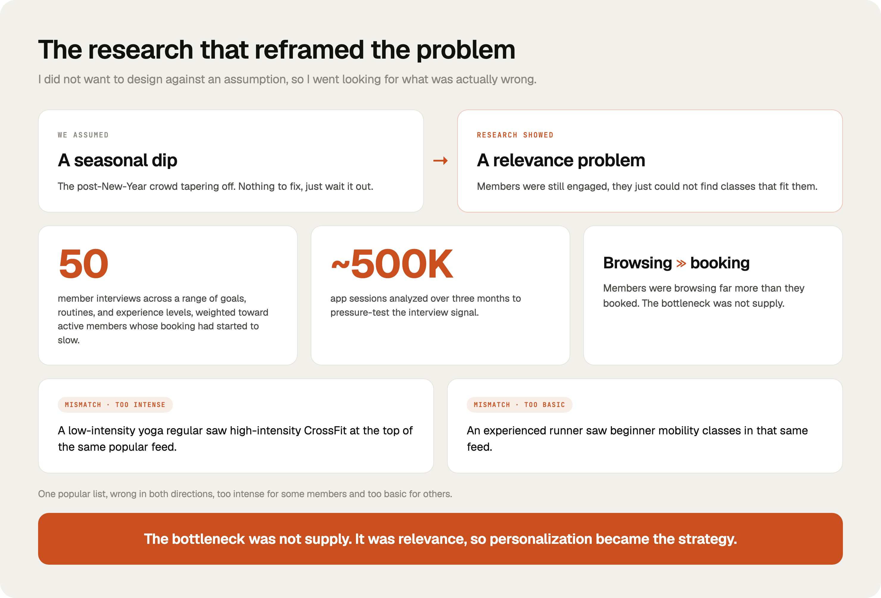
The seasonal explanation did not match member behavior.
To answer that, I interviewed 50 members and reviewed three months of in-app activity, about half a million sessions. They were still browsing. They just were not booking what the feed showed them.

Who I spoke with
I spoke with members across different goals, routines, and experience levels. I deliberately included active members whose booking had started to slow, because analytics flagged them as the most likely to cancel. The mismatch went both ways. The same popularity feed could feel too intense for a low-intensity yoga regular and too basic for an experienced runner.
Why fitness level was too blunt
Fitness level was a useful start, but too rough to explain what people actually booked. Someone who trains a lot might still be exploring, and a newer member might be pushing hard. So I looked at what members really weigh when they pick a class, how hard they want it, their goal, how experienced they are, when and where they go, and whether they want routine or variety. I synthesized those patterns into five behavioral personas that shaped the ranking's inputs and the experience requirements. They were not permanent labels on people, and they were not classes the algorithm assigns. I led the research and the decision framework, then designed the screens that capture preferences, explain each pick, and let members correct it. Analytics grounded the personas in real bookings and sized how often each one showed up, and the product manager decided which to focus on first. Because people shift between these behaviors during the week, the app pays attention to what you are doing right now instead of stamping you with one label for good.
Each persona below captures a recurring decision pattern. It shows what the app has to respect, what the ranking can use, and when it should adapt.
The problem was not a shrinking interest in fitness. Members were active. The popularity feed was putting the same classes in front of everyone, whatever each member actually needed.
We compared rules with machine learning.
Because the research pointed to fit, the team agreed that class discovery had to move past one popular list and respond to each member. The open question was whether hand-written rules could do enough, or whether the number of members, classes, and changing preferences called for a learning model.
| Rule-based | Machine learning chosen | |
|---|---|---|
| Personalization | Limited to the rules we define | Can respond to more combinations of goals and behavior |
| Finding patterns | Only finds the patterns written into it | Can find useful patterns we did not anticipate |
| Effort | Quicker and less expensive | Needs more data and engineering work |
| Explanation | Easier to explain | Needs the reason and controls designed into the experience |
I recommended machine learning because a fixed set of rules would struggle with all the combinations we had already seen: class type, schedule, location, goals, experience, and changing habits. A prior internal prototype had also shown a learning model was feasible. But the extra complexity was only worth it if members could understand and correct the results.
What the experience needed to do
That condition became my brief for the experience. To make the model usable, I designed around three questions: Does the class fit this member? Can they see why it appeared? Can they change what the app uses?
Use goals and history
Classes should reflect the member rather than general popularity.
Explain each suggestion
The app should say why a class appeared in plain language.
Let members change it
Members should be able to adjust individual inputs or turn personalization off.
Of the three, Fit reached furthest into the system. So I mapped every member decision to something the app could capture and the ranking could read.
| What a member wants | Where the app learns it | What the system matches on |
|---|---|---|
| How hard they want it | Onboarding question | How intense the class is |
| Their main goal | Onboarding question | What the class is for (strength, stress, weight…) |
| How experienced they are | Onboarding + classes they finish | Class difficulty and beginner-friendly flag |
| When and where they go | Their booking times and location | Class schedule and location |
| Routine vs. variety | How varied their past classes are | How much variety to mix in |
I designed the first two columns, how members decide and the screens that capture it. The data and engineering teams turned those into what the ranking actually uses.
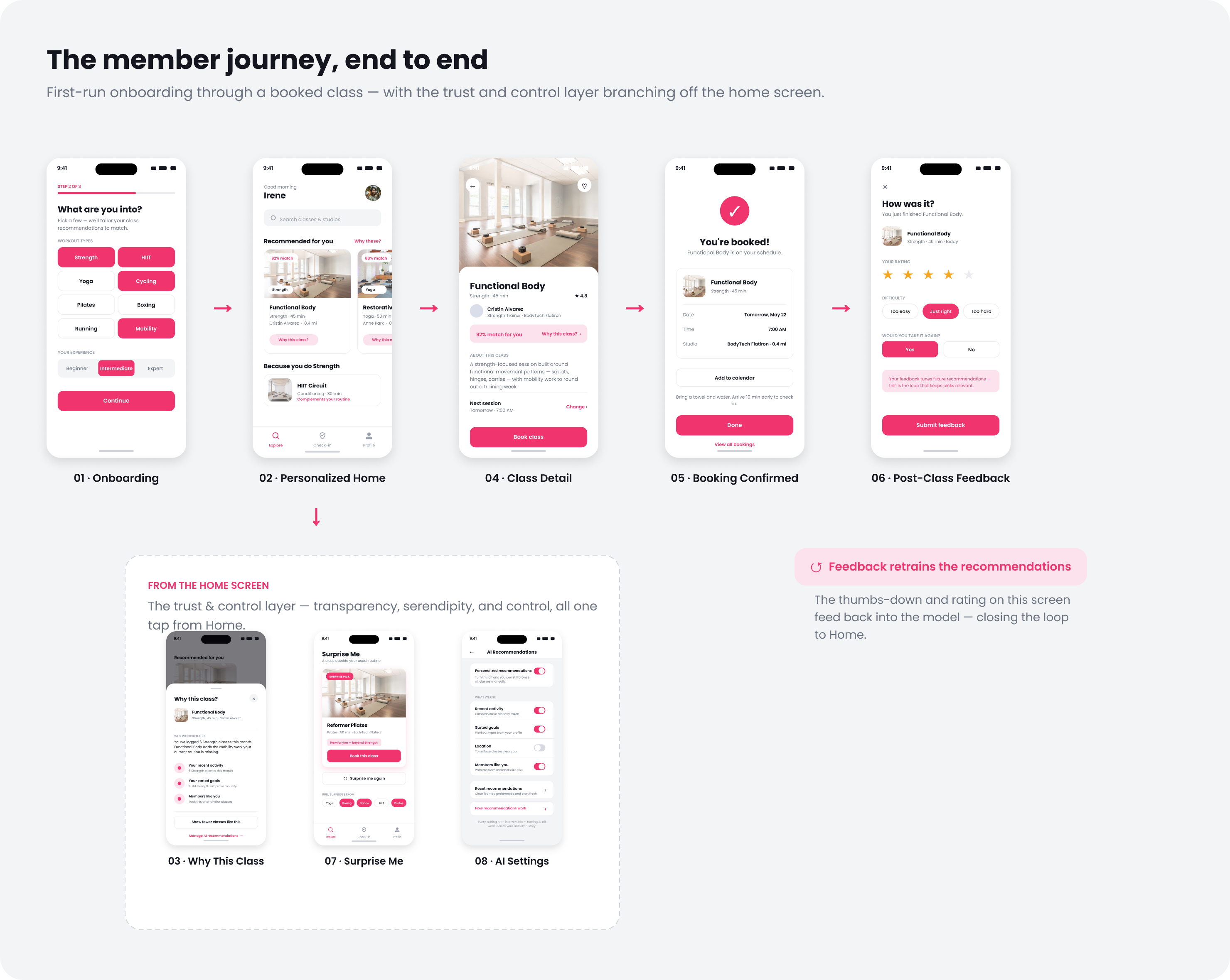
The recommendation starts in onboarding and ends with a booked class.
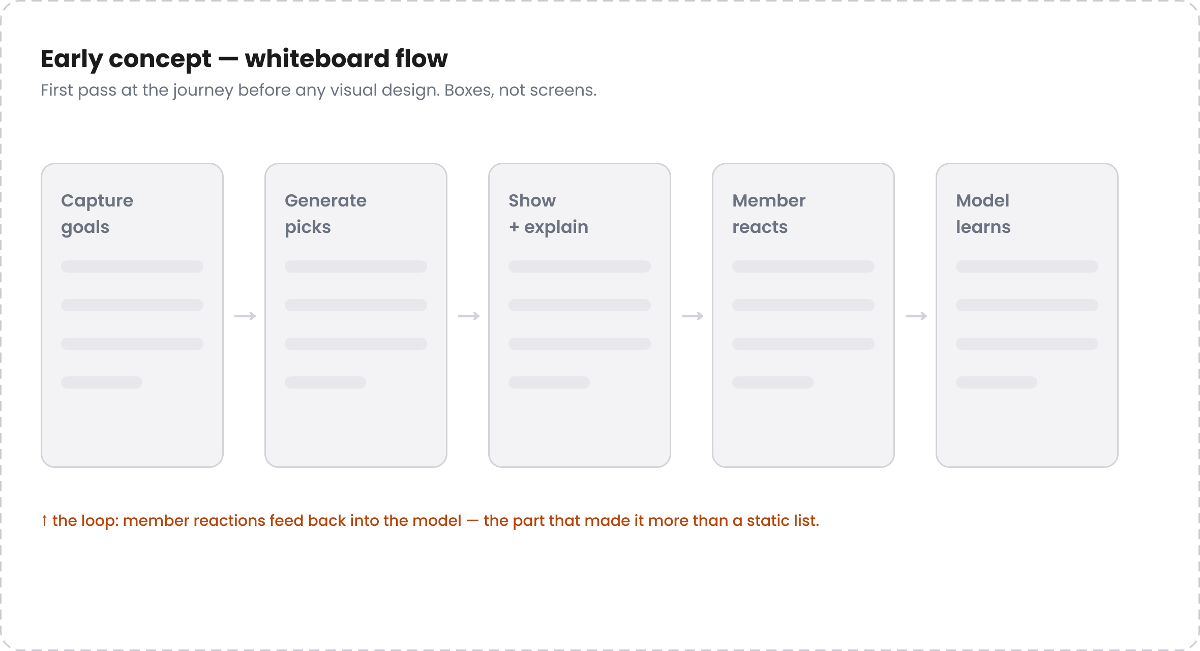
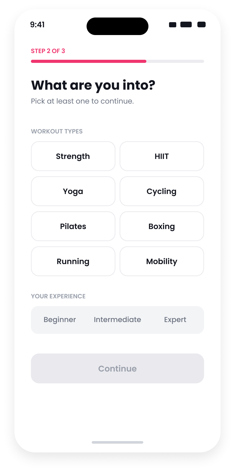
Onboarding asks about goals, workout types, and experience. The home feed uses those answers with recent activity, each card explains its reason, and settings let members change or stop personalization.


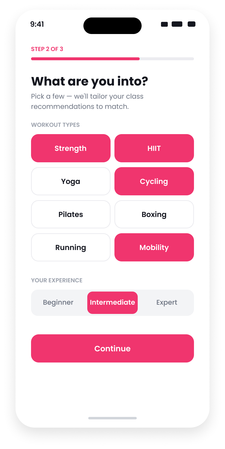
Onboarding asks only what the feed needs
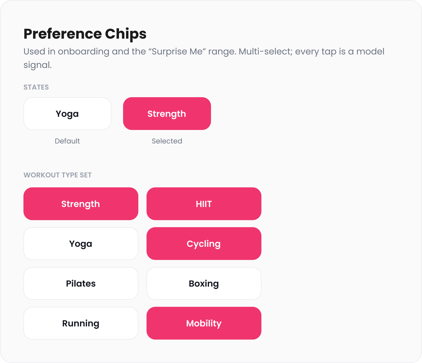
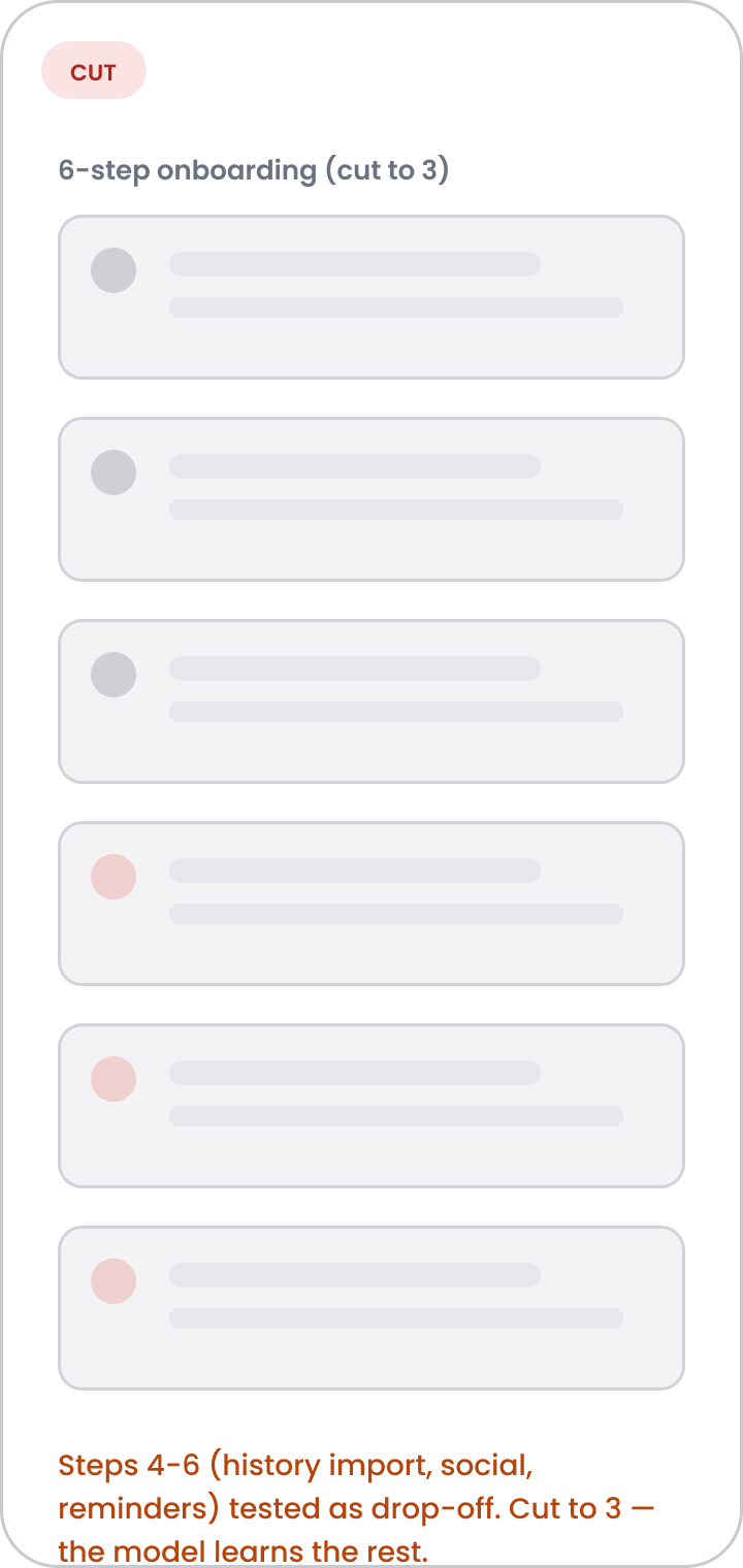
New members do not have a workout history yet, so onboarding asks about goals, workout types, and experience. Adding questions can lose people. I kept it to quick multi-select chips and used the answers to improve the first set of classes.
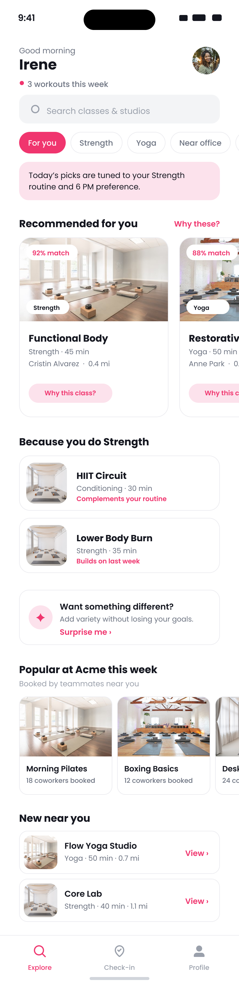
A short list of strong matches
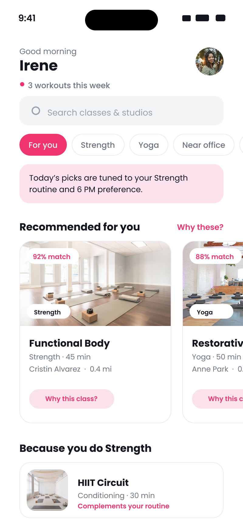
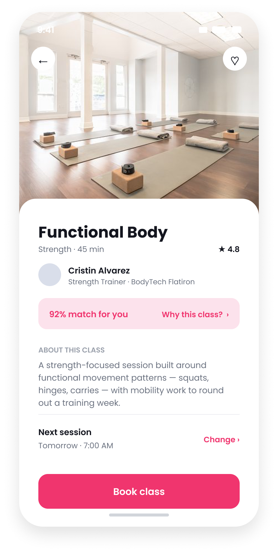
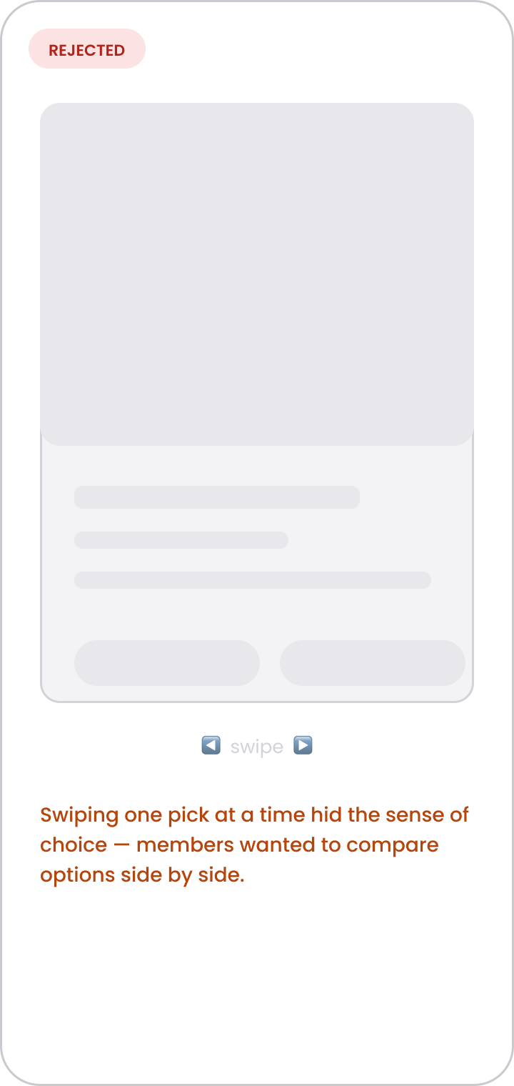
The home feed ranks classes by the member's goals and activity rather than making general popularity the main order. I used a carousel so people could compare a few options with one thumb without scanning the full catalog. I used unmoderated testing to set the card size, amount of detail, and scroll behavior. The rest of the page includes filters, familiar workout types, occasional variety, and classes popular with coworkers.
Anatomy of a recommendation
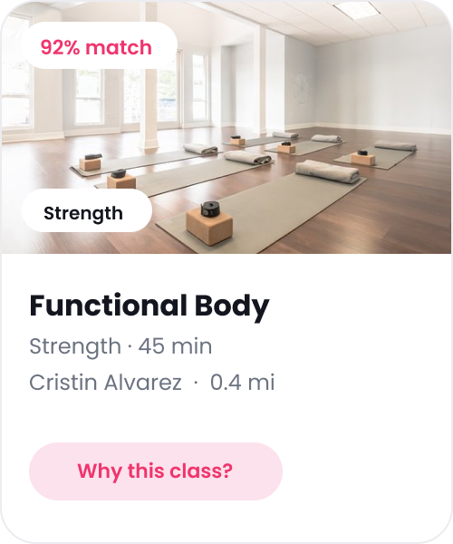
The card gives members enough information to judge a class without opening it, plus a way to ask why it appeared.
1
2
3
4
- 1Match scoreA fit percentage, so a member can judge relevance at a glance instead of trusting a popularity rank.
- 2Class typeThe category up front, so the kind of workout is obvious before tapping in.
- 3Title & detailsFocus, length, instructor, and distance, enough context to decide without opening the class.
- 4Why this class?Opens the explanation behind the pick, and the controls to tune it or turn it off.

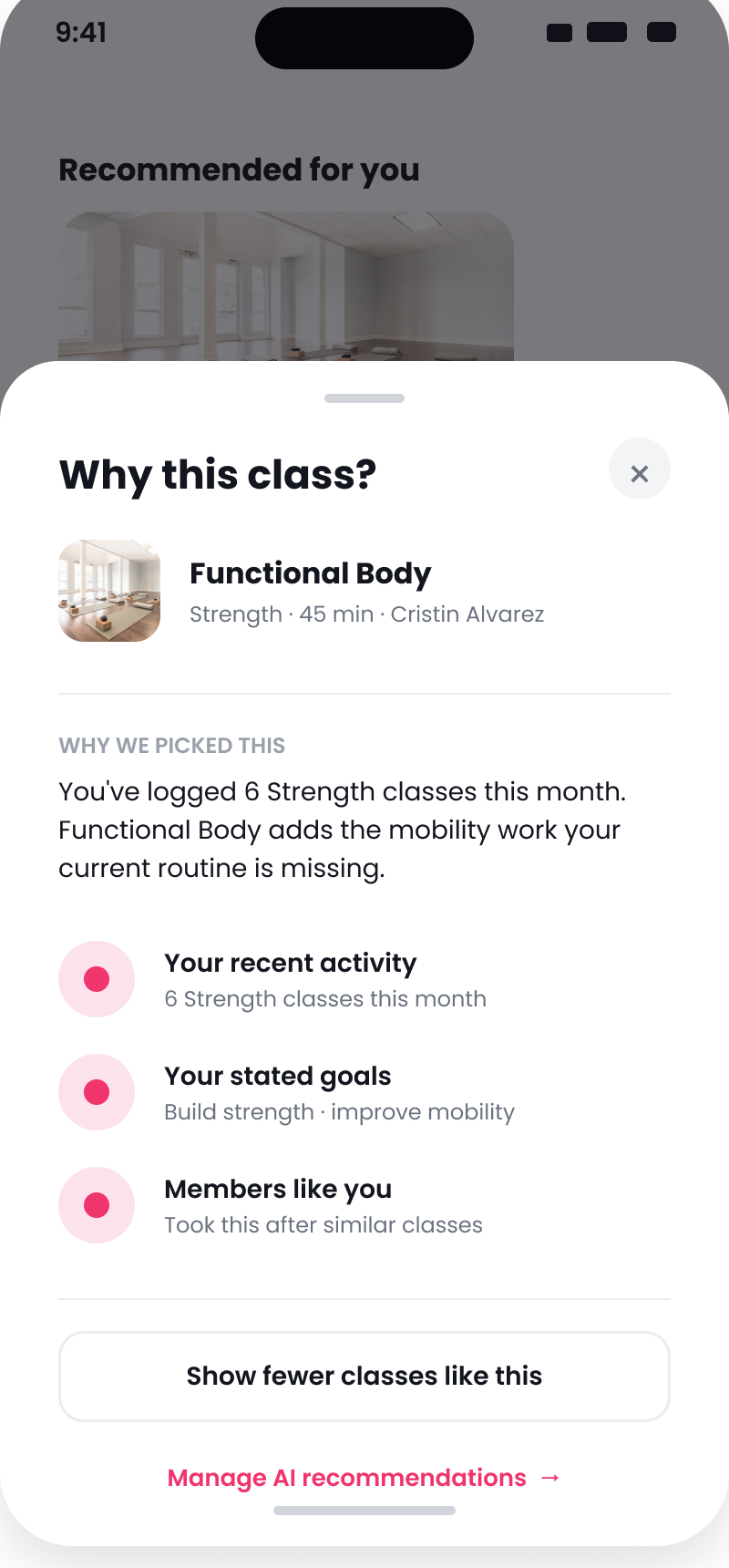
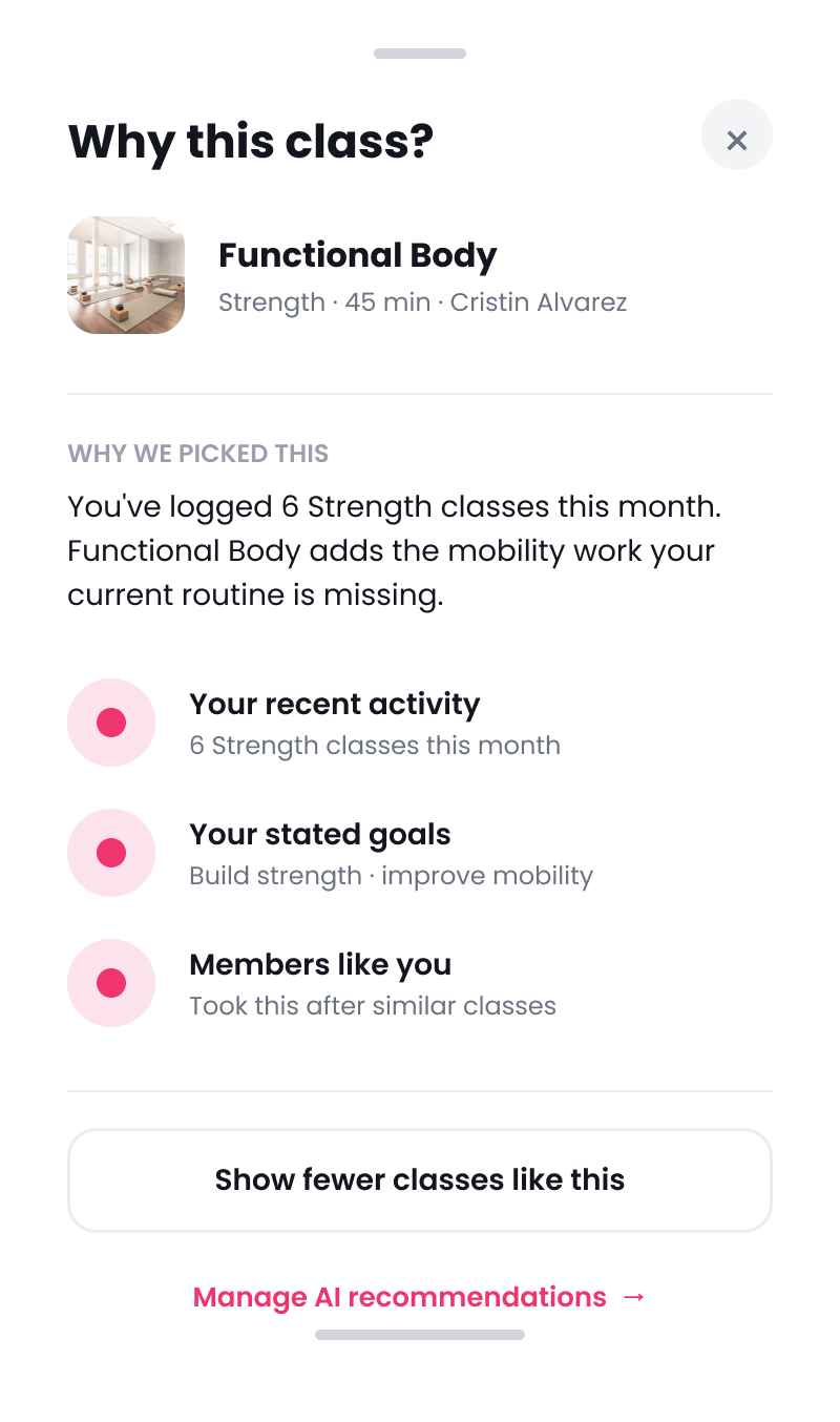
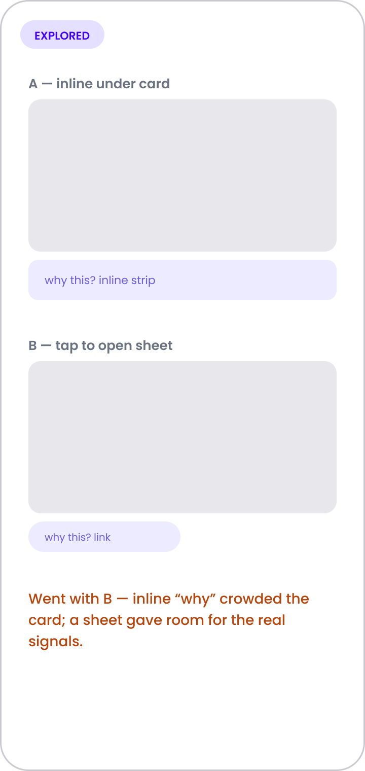
“Why this class?” explains the recommendation
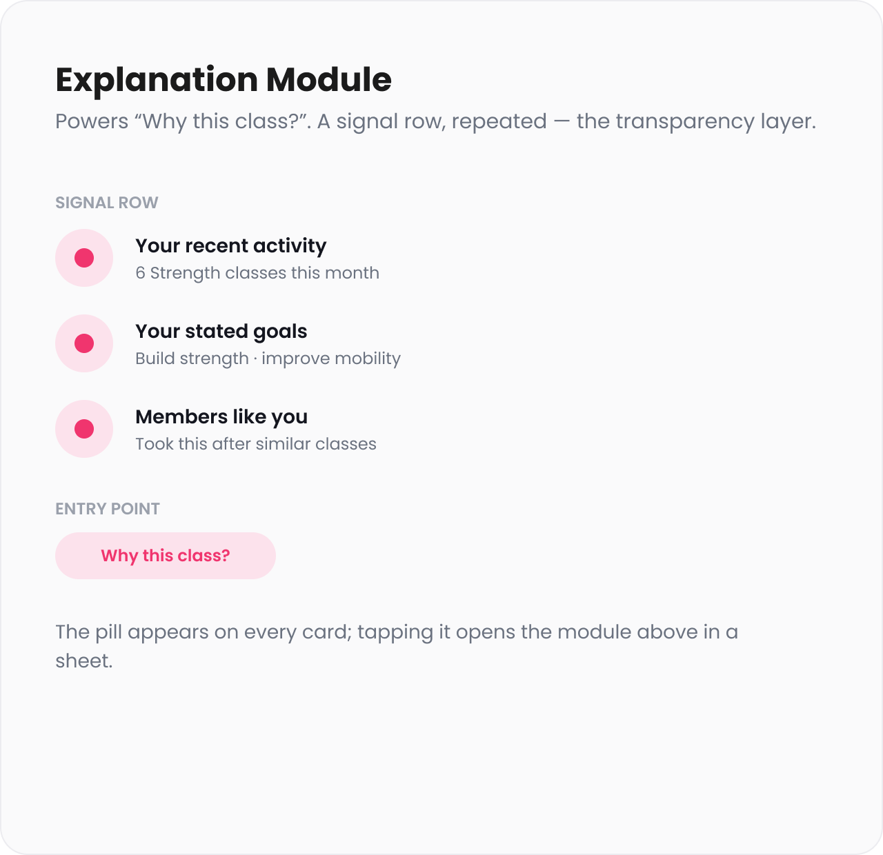
The sheet names the information behind the suggestion: recent activity, stated goals, and patterns among members with similar habits. It avoids technical language. From the same place, a member can ask for fewer classes like it or open personalization settings.

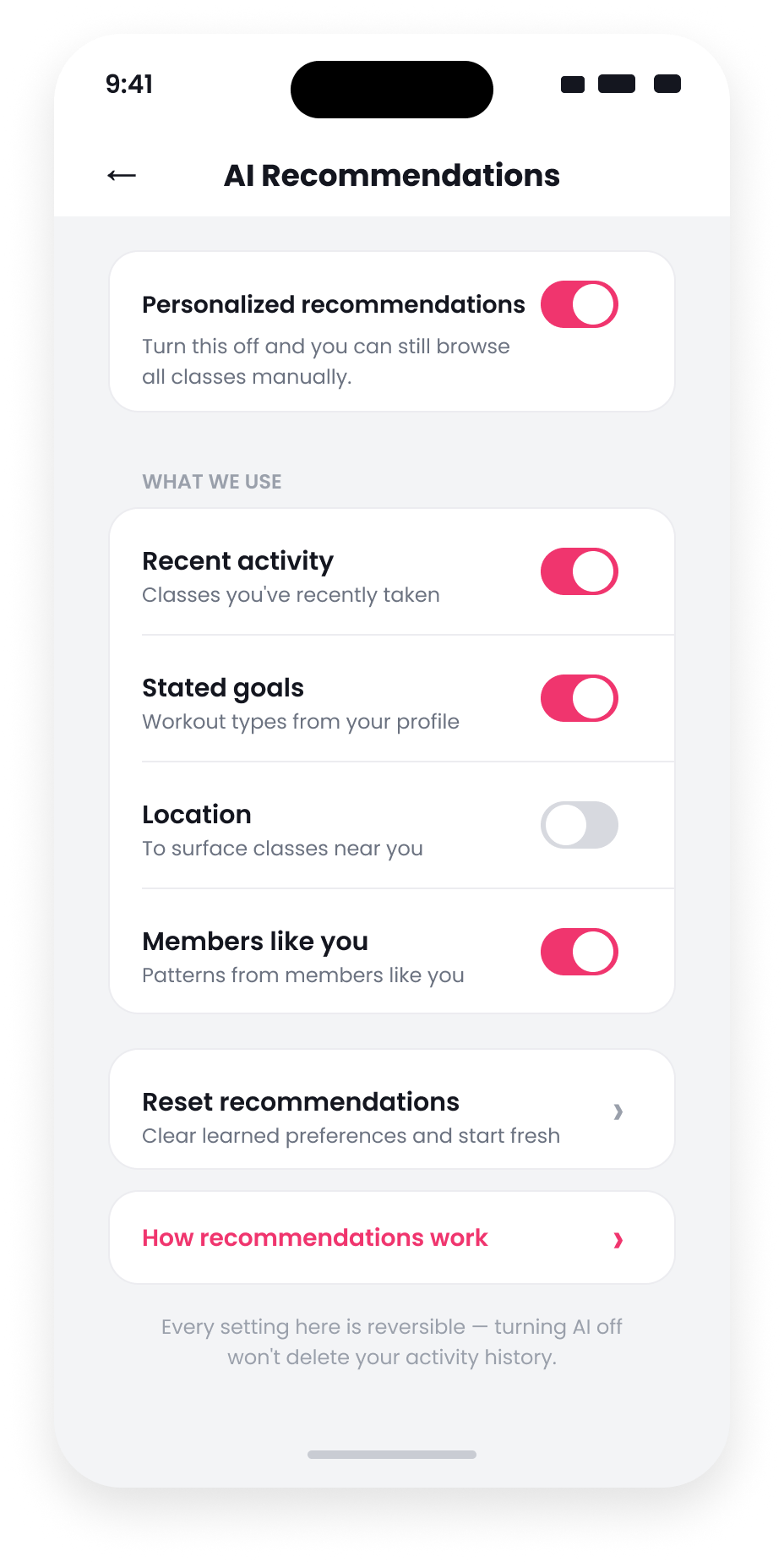
Members can change or stop personalization
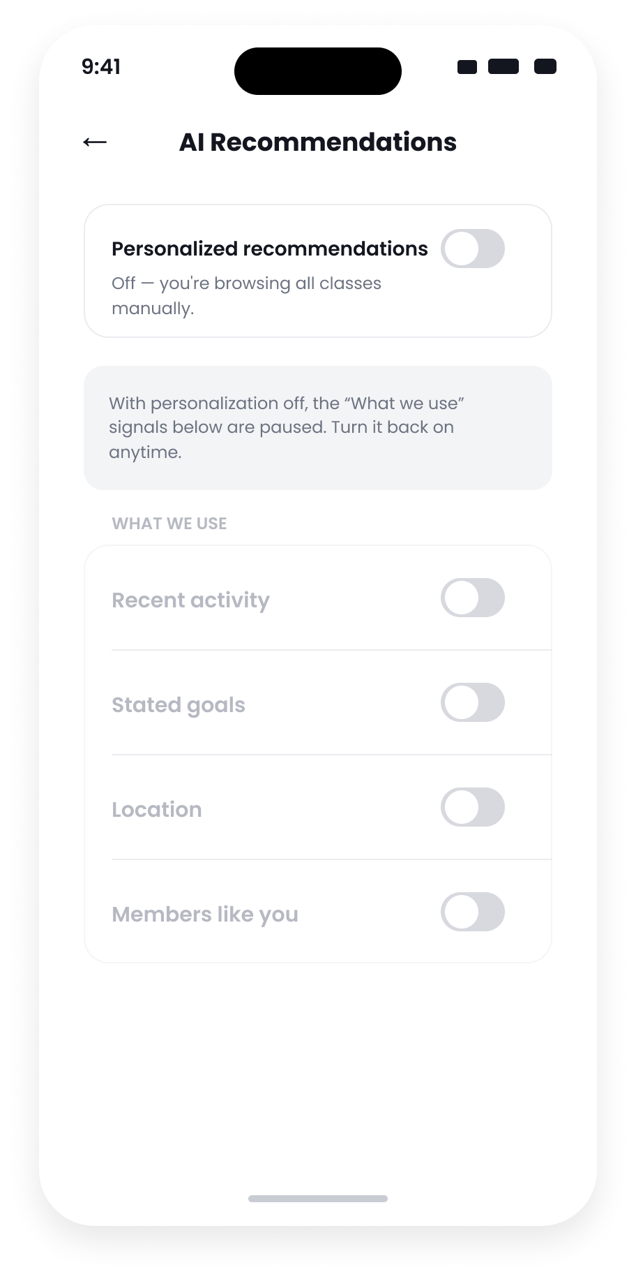
A member can stop using one input, such as location, without turning off everything. They can also switch personalization off completely and return to manual browsing. Those choices remain available at any time.

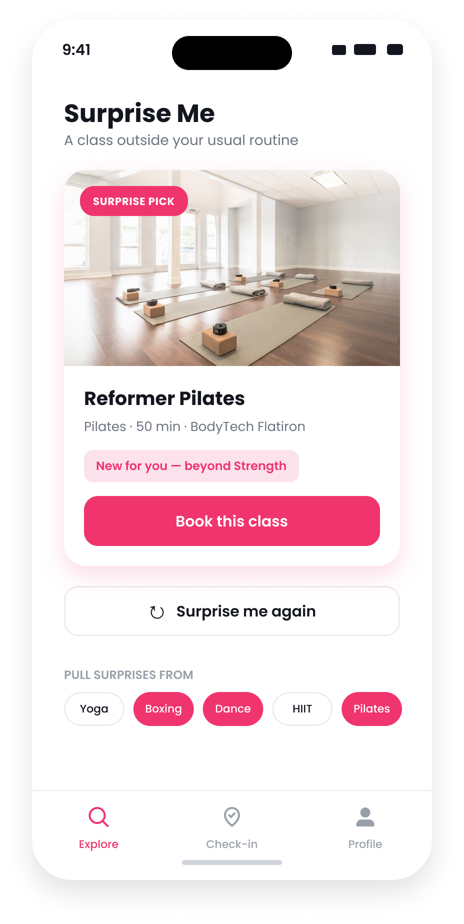
“Surprise Me” widens the feed
Personalization can keep showing more of the same. The "Surprise Me" card offers classes outside a member's normal pattern, but only from categories they choose. It reads as an optional invitation rather than a recommendation error.
From class details to feedback
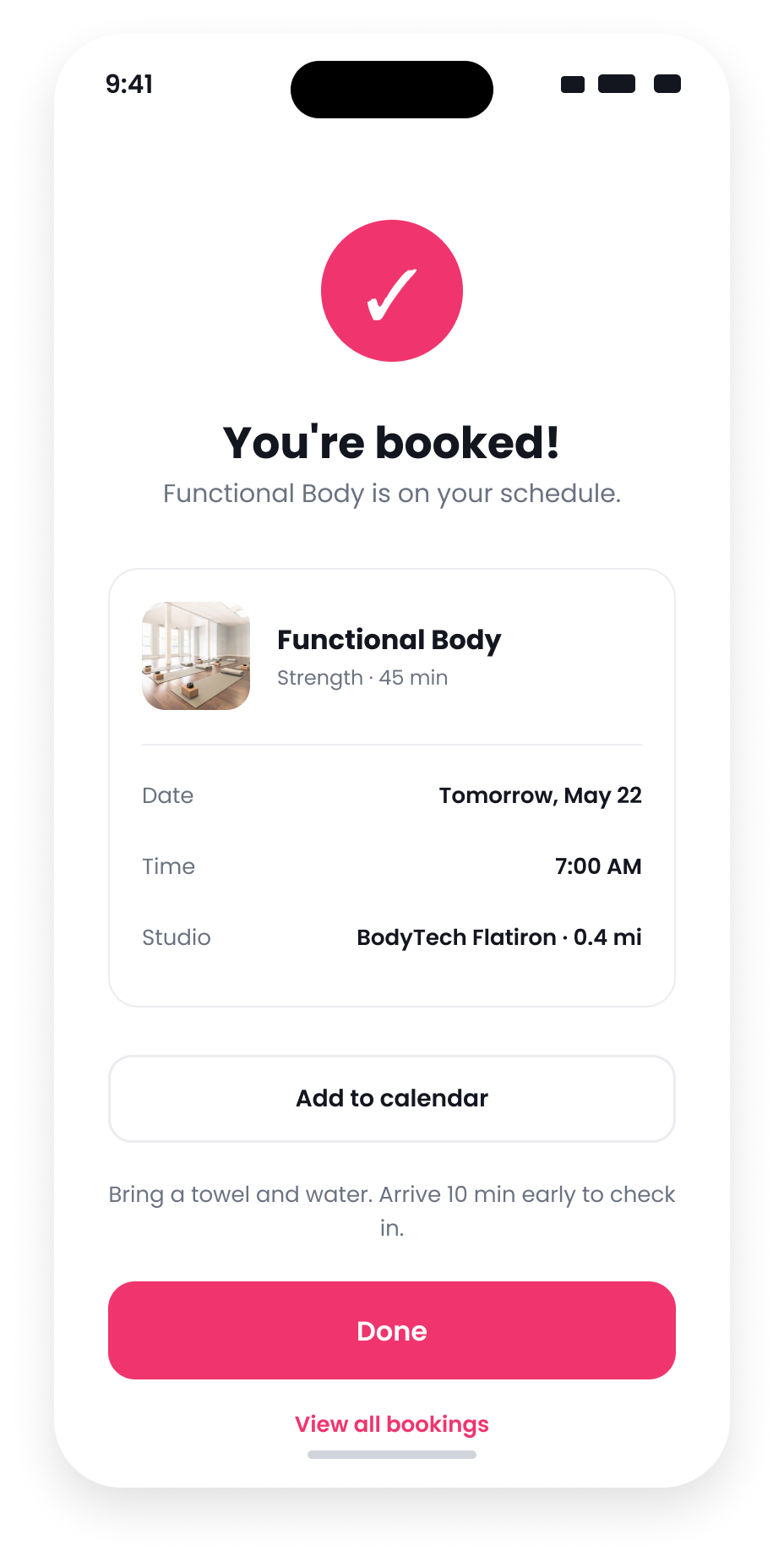
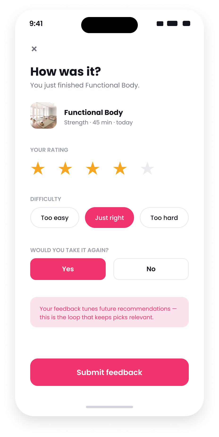
The explanation follows the class into detail and booking. Afterward, a simple thumbs up or down helps improve future suggestions.


The components behind it
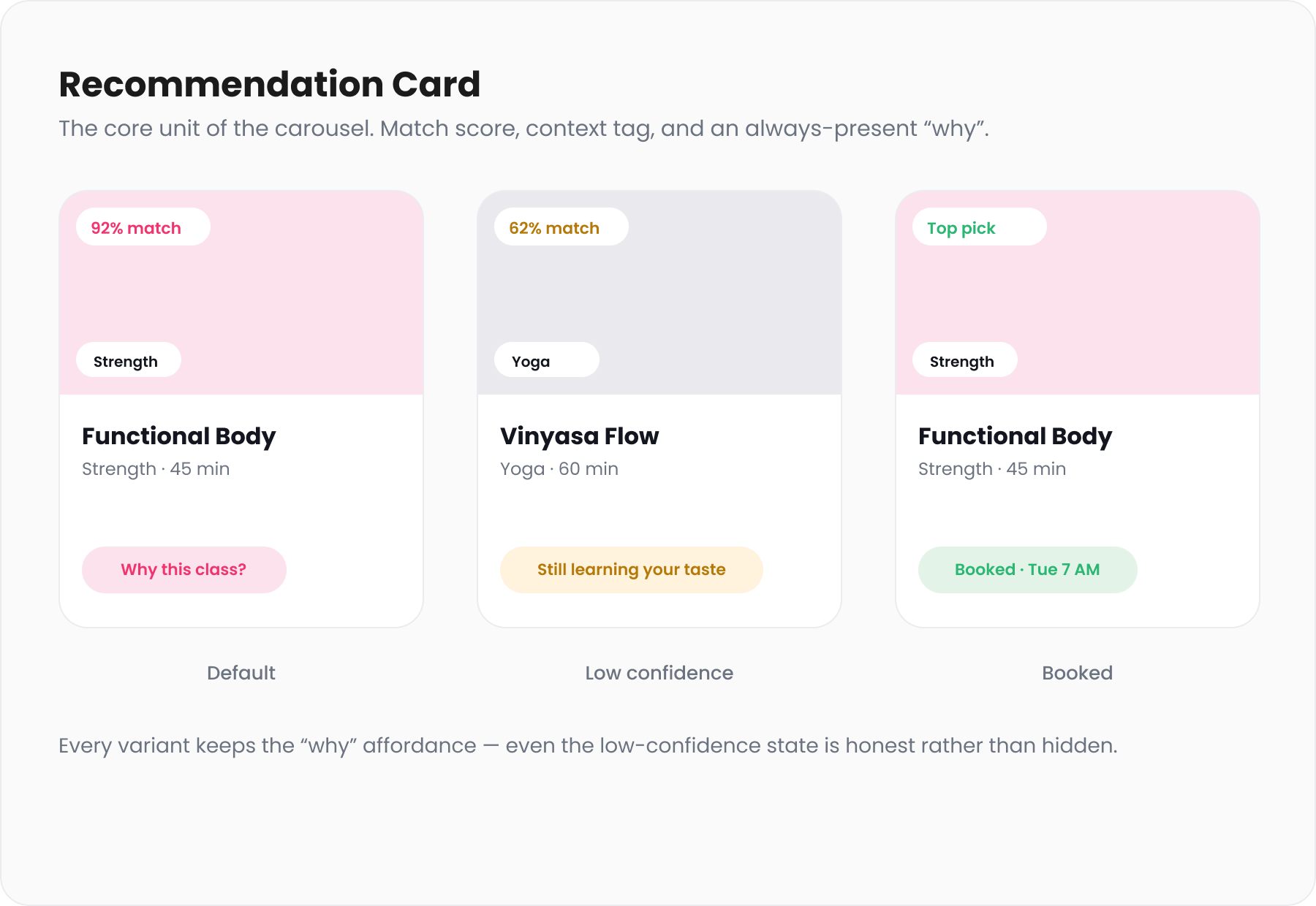
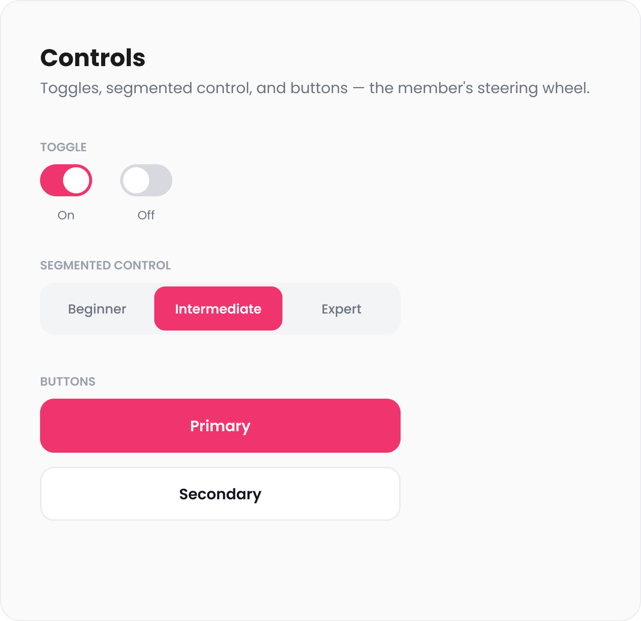
I designed the repeated pieces as reusable components with the states shown below.


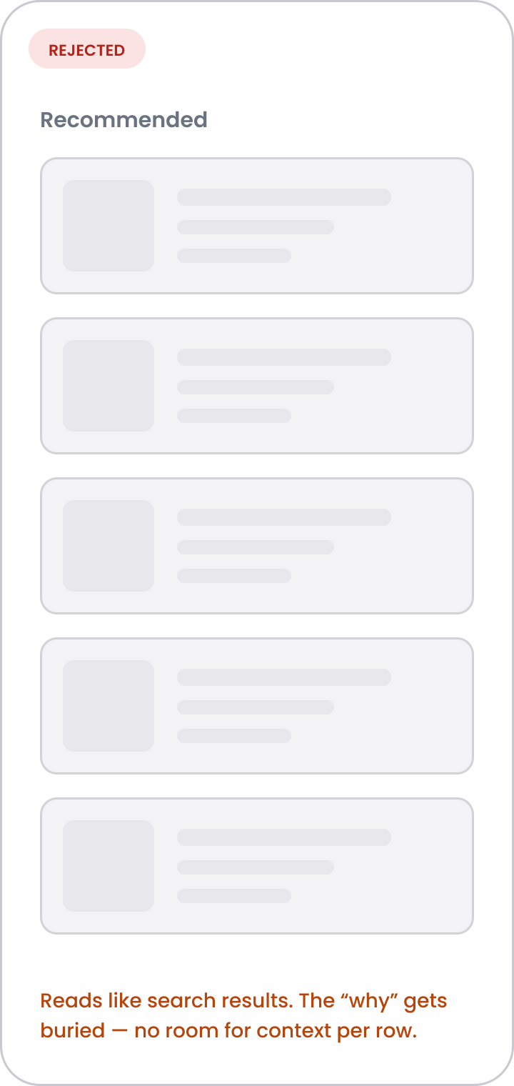
Directions I tried and rejected
I kept these explorations rough so I could compare the interaction before polishing the screens.


The design also covers weak or wrong recommendations.
Personalization needs clear limits. Members should know what information is used, new members should not see made-up confidence, and a poor suggestion should be easy to correct.
The app explains that suggestions use onboarding goals, workout history, and patterns from similar members. Individual inputs, including location, can be turned off.
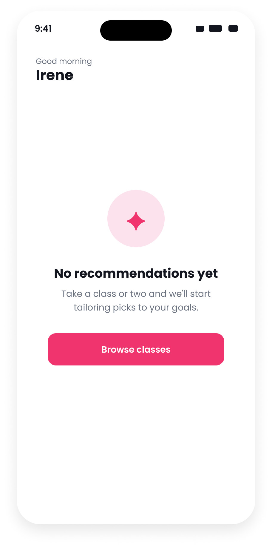
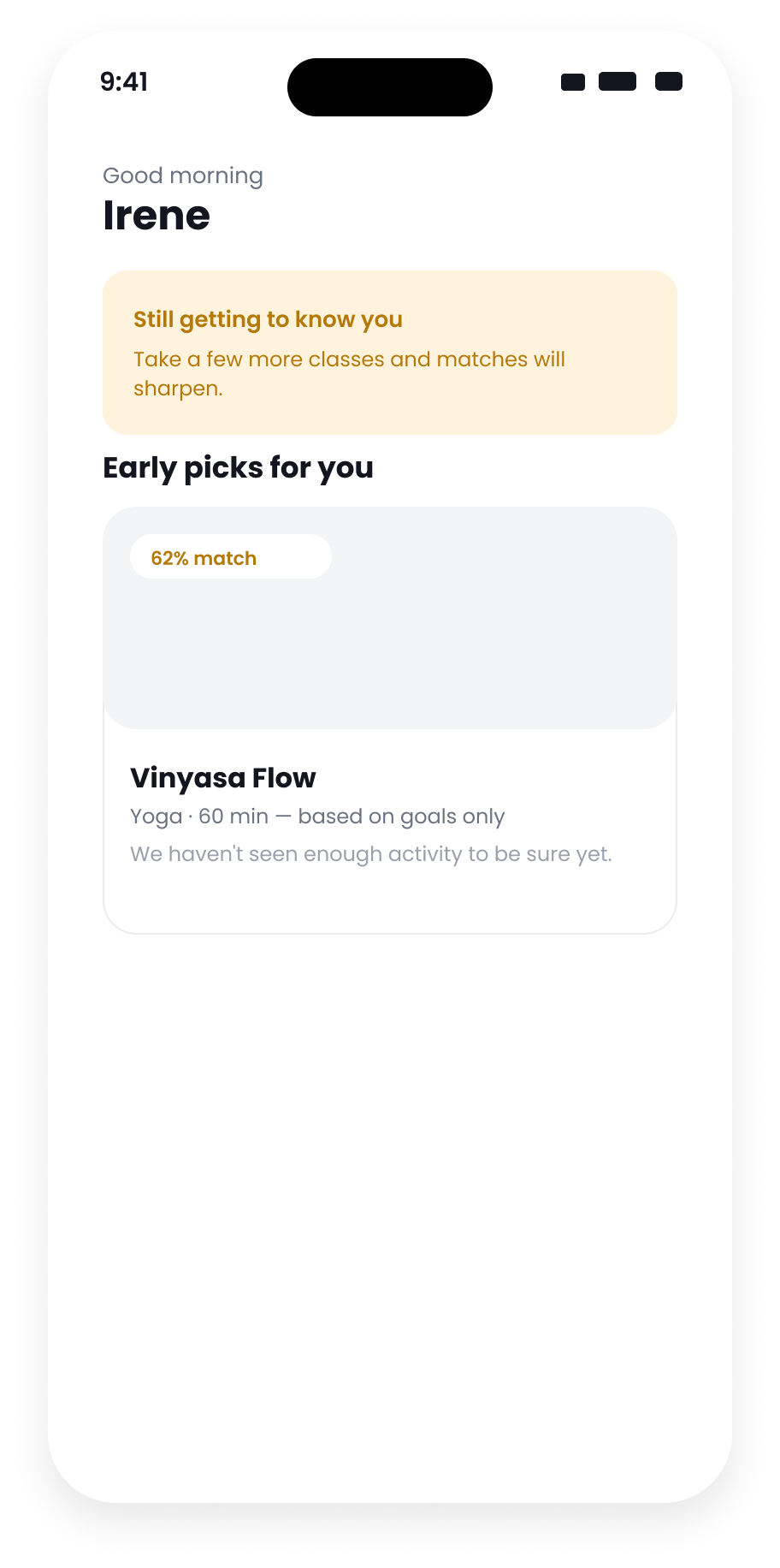
On day one, the app uses onboarding answers only. It does not show a confident match percentage when there is not enough history to support one.
Members can ask for fewer classes like it, give a thumbs down, or turn personalization off.
The ordinary failure states
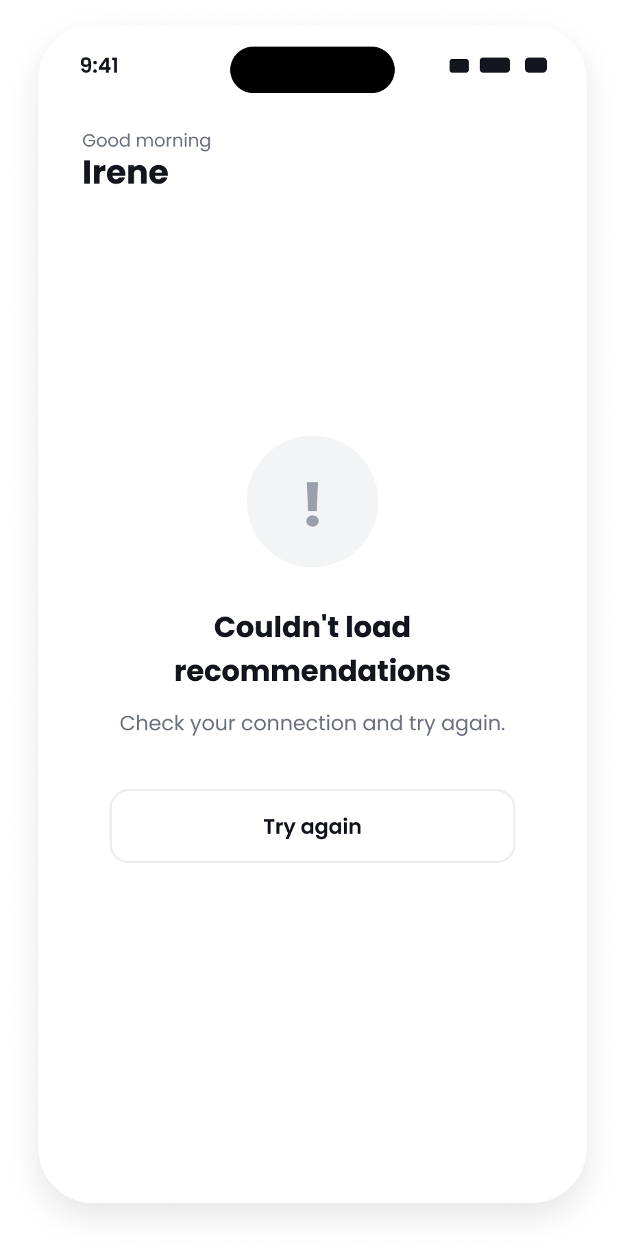
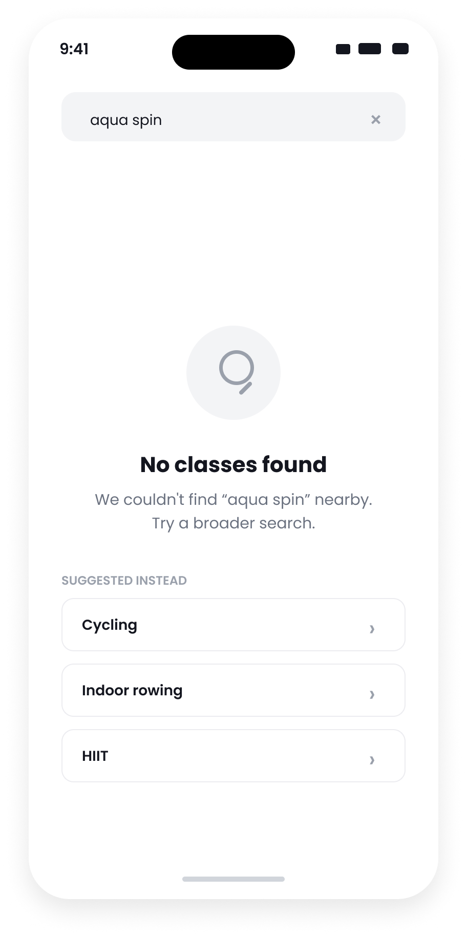
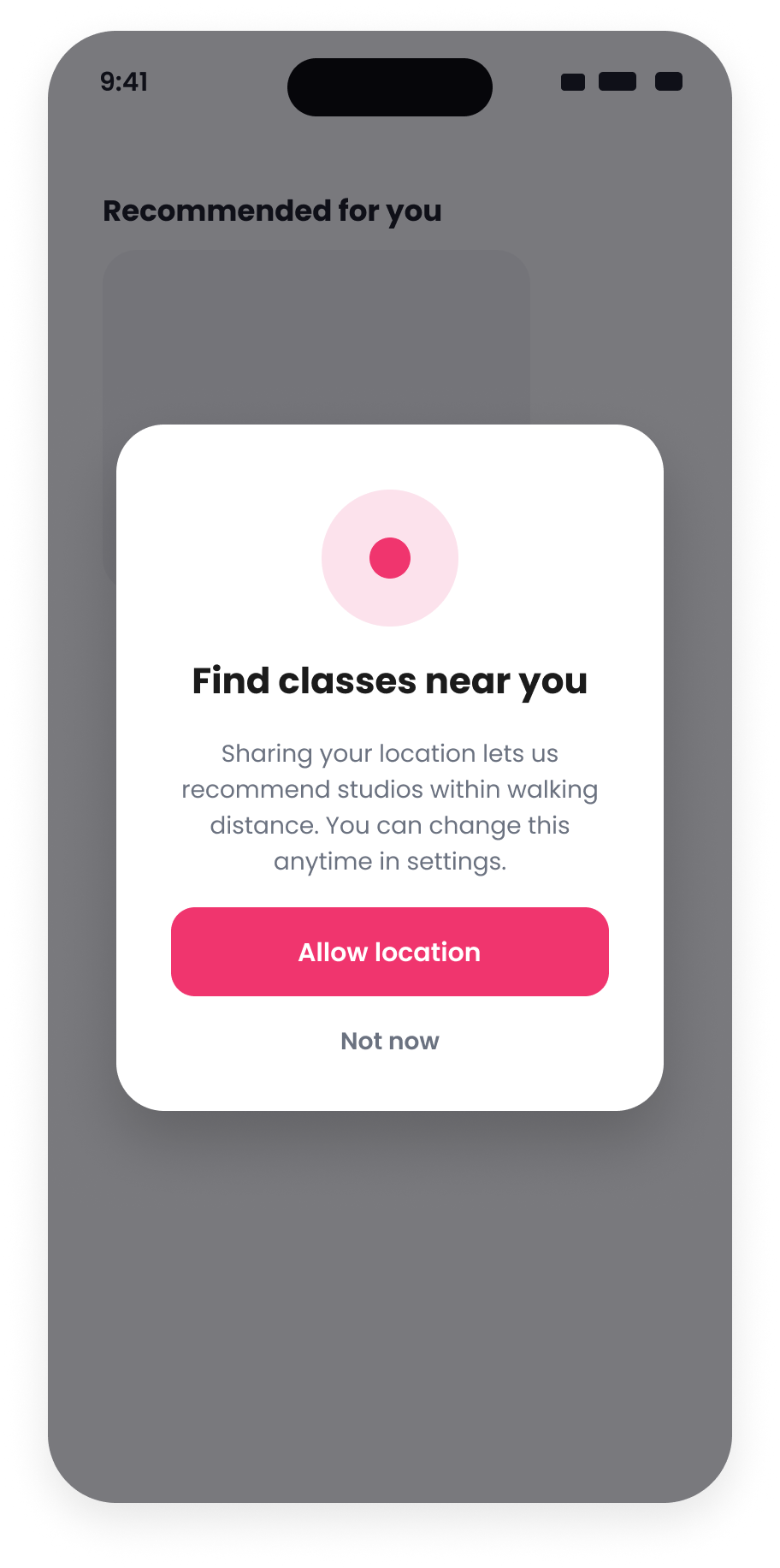
I designed loading, no history, low confidence, unavailable recommendations, missing permissions, and no results. Each state tells the member what is happening and gives them another way to continue.


Adapting the recommendation for a watch
Later that year, I designed the watchOS and Wear OS versions. I did not shrink the phone feed. Each watch shows one recommendation with enough information for a quick glance, following the conventions of that watch.


Bookings increased, but one number is only a projection.
After launch, I compared early results against the previous three months. I treat them as directional, not a clean experiment: other teams were changing sales messaging at the same time, so I cannot attribute all of the change to the feed, and the premium upgrade figure is a projection, not a measurement.
By the numbers
What I looked at
I tracked how quickly members found a relevant class, what they opened, how far they moved through the carousel, completed bookings, repeat attendance, and how often they turned personalization off. Usability sessions, in-app surveys, and trainer feedback helped explain the activity data.
To measure the difference more cleanly, I would show the old and new feeds to comparable groups instead of comparing time periods.
Reflection
The explanation could not be added after the recommendation was designed. The score, reason, and controls had to work together on the card and in the detail sheet. I would keep that order next time: first confirm why discovery is failing, then choose the recommendation method, then design the explanation and correction states with it.