Fixing the design system behind Gympass onboarding.
Dark mode made the problem impossible to ignore. Headings disappeared, helper text failed contrast, and cards stayed white. The same screens looked fine in light mode, which is why the underlying problem had gone untouched: more than 40 onboarding screens still used raw colors and spacing instead of the shared system.
I reviewed the existing tokens and components, filled the gaps, and wrote a one-screen usage rule for each token. Then I worked with engineering to update React Native onboarding across iOS and Android. I owned the Figma library, documentation, and work with the product squads. Engineering connected the same token names to the app and checked the interaction behavior in Storybook.

Dark mode broke the onboarding flow for 41% of sessions.
In dark mode, parts of onboarding were unreadable and the primary action disappeared on some screens. Completion was 58%, compared with 74% in light mode. Five squads shared the same Figma library, but nobody could trace a screen's colors and states back to a dependable token. People fixed their own screens and avoided changing shared styles because they could not tell what else might break.
One screen, three failures
The heading nearly vanished
It was still using a color picked for light mode, so on a dark background it nearly disappeared.
Helper text failed contrast
It dropped below readable contrast in dark mode, so the guidance turned into visual noise.
Cards stayed white
The card background wasn’t tied to a color that switches with the theme, so it stayed white.
These looked like three unrelated bugs. They came from the same issue: the screen was still wired to values that only worked in light mode.
The shared library was no longer actually shared.
The same component looked different from one squad's file to another. Designers detached instances, engineers changed values screen by screen, and both groups were cautious about touching the shared library. Dark mode did not create those inconsistencies. It made them visible.
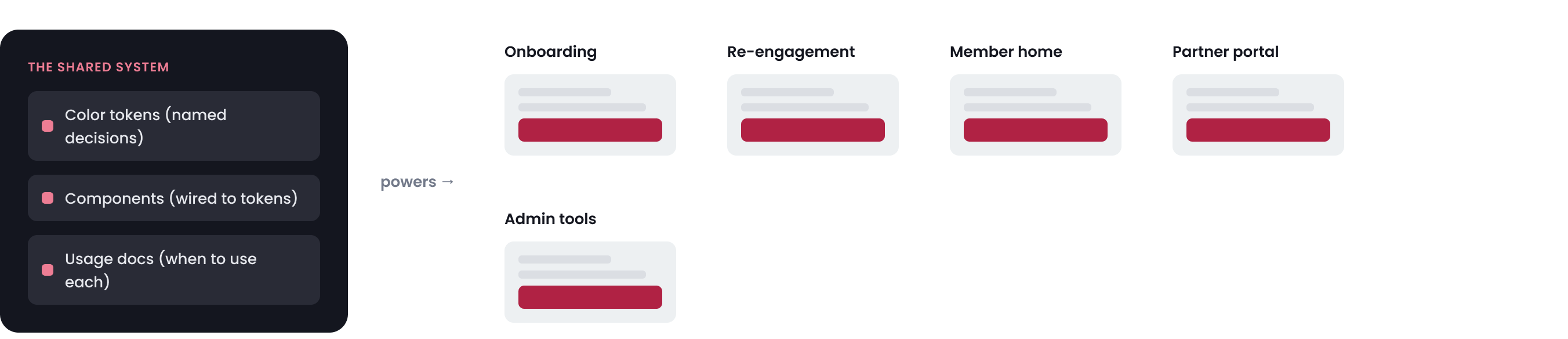
What the system included
For this project, the system was the Tokens Studio source, the Figma styles and components connected to it, and the usage documentation. A change only counted as a system change if it appeared in the token, the component, and the screen members used.
A screen-level fix would not hold
I could fix one screen in a few minutes by assigning a dark value. That would leave the other screens untouched, and the next squad could repeat the same mistake. The fix had to work across a live product while leaving light mode unchanged.
~200 color references to re-point
A few raw colors were doing several jobs across dozens of screens: page backgrounds, cards, text, and disabled states. I had to separate those jobs before assigning dark values.
Light mode could not change
Most members still used light mode. I added theme-aware semantic tokens alongside the old values, then updated screens in stages instead of replacing everything at once.
Five squads kept designing new screens
The product work did not pause for the cleanup. New screens had to use the corrected components by default or the same problems would return in the next sprint.
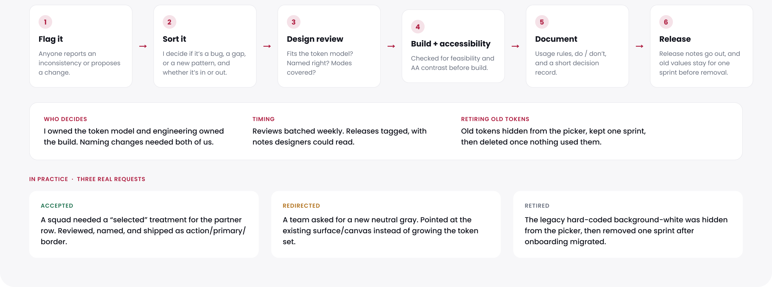
The token itself was the small part. Most of the work was finding every place it should apply, updating those screens, and making the corrected component easier to use than a local override.
I started by finding where Figma and the app no longer matched.
I interviewed the onboarding teams, reviewed their Figma files, checked where components had been detached, compared Figma with Storybook, and inventoried the Tokens Studio set. Engineering helped me confirm which styles already matched the app and which values had been changed on individual screens.
What the review found
Couldn’t tell one decision’s job from another
Color, type, and spacing names described appearance instead of purpose. Teams could not tell which values were reusable, so they guessed or created another one.
Only the default state was designed
Many components had a default state but no agreed hover, focus, error, disabled, dark, or platform treatment. Teams filled those gaps in their own files.
Design and code used different names
Figma styles, token names, and code used different labels for the same decision. When the trail went cold, teams patched the value locally.
Teams copied and tweaked instead of reusing
Teams copied components into local files and changed them there. The same spacing or state problem ended up with several different fixes.
No one owned the gaps
When a rule was missing, it was unclear whether design, brand, or engineering should approve the change. Some gaps stayed open because no team owned the decision.
I used four checks for every change: what the decision was for, where it appeared, who maintained it, and whether design and code used the same name. If I could not answer those questions, the token or component was not ready for the library.
I completed the missing tokens, states, and usage rules.
I reviewed the system token by token and component by component. Each decision needed a clear purpose, complete states, values for the supported themes and platforms, and a team responsible for maintaining it.
Rules I used during the cleanup
Name the job, not the value
Colors, type, spacing, and component states used names based on purpose. A designer chose text/secondary, not a grey that happened to work on one screen.
Start with what teams already used
I started with the high-traffic onboarding components and kept the transition gradual.
Design every accessible state
AA contrast and every interaction state had to be covered. The default state alone was not enough.
Add component tokens only when needed
Component-level tokens stayed limited to the few components that really changed. New ones went through review.
Use the same names in design and code
Figma and the app used the same semantic names. I kept old names working until the updated screens matched.
My scope was the design side: token names and gaps, Figma styles, component states, usage rules, and the definition of covered versus missing. Engineering connected those decisions to the app. The figures below came from the token set we used, not a manually prepared presentation.
One missing token reference affected hundreds of surfaces
Tokens were connected in a chain. If a theme missed one reference, every component using it lost the correct value. Color made this easiest to see, but type, spacing, and component states followed the same structure.
In the example below, a third brand is missing brand.primary. The action color has nothing to reference, and neither does the button color connected to it. Eighteen components used that chain.
- Brand
blue.600#246BFE - Brand
brand.primary→ blue.600 - Core DS
action.primary.bg→ brand.primary - Component
button.primary.bg→ action.primary.bg
- Brand
teal.600#008F7A - Brand
brand.primarymissing in theme - Core DS
action.primary.bgmissing value - Component
button.primary.bgmissing value
Buttons, banners, navigation actions, empty states, and checkout actions all used the missing reference.
Every token and reference needed a team responsible for it. I did not add a new state or component exception until that team had reviewed it.
I mapped every supported theme in one matrix
I built a Figma review page with one row per token job and one column per theme, brand, or platform condition. Each cell showed a chosen value, a value shared with the base theme, or a gap. I compared it with the styles, components, and app. Dark mode was only one column; the same page exposed missing values in high contrast, a third brand, and right-to-left layouts.
| Semantic | Gympasslight | Gympassdark | Brand Bdark · compact | Brand Cdark · high-contrast | Arabic · RTLlarge type |
|---|---|---|---|---|---|
| text/primary | #14161Fset | #F4F4F6set | #F4F4F6shared | #FFFFFFset | #14161Fshared |
| text/secondary | #6B7280set | #9AA0ABset | #9AA0ABshared | #D6D9DFset | #6B7280shared |
| surface/card | #FFFFFFset | #1A1A1Fset | #16161Bset | #000000set | #FFFFFFshared |
| action/primary/bg | #E6326Eset | #FF4D85set | #1F8A70set | —missing | #E6326Eshared |
| border/focus | #E6326Eshared | #FF4D85shared | #1F8A70shared | —missing | —missing |
| type/title/lg | 28 / 34set | 28 / 34shared | 24 / 30set | 28 / 34shared | 30 / 40set |
| space/stack/md | 16pxset | 16pxshared | 12pxset | 16pxshared | 16pxshared |
| button/disabled | boundset | boundshared | boundshared | —missing | boundshared |
A blank cell meant the token had no value for that theme. In the product, that could become an invisible focus ring, a missing disabled state, or a contrast failure.
I treated every blank as unfinished. It received its own value or deliberately reused the base theme. Engineering used the same rule in its automated check.
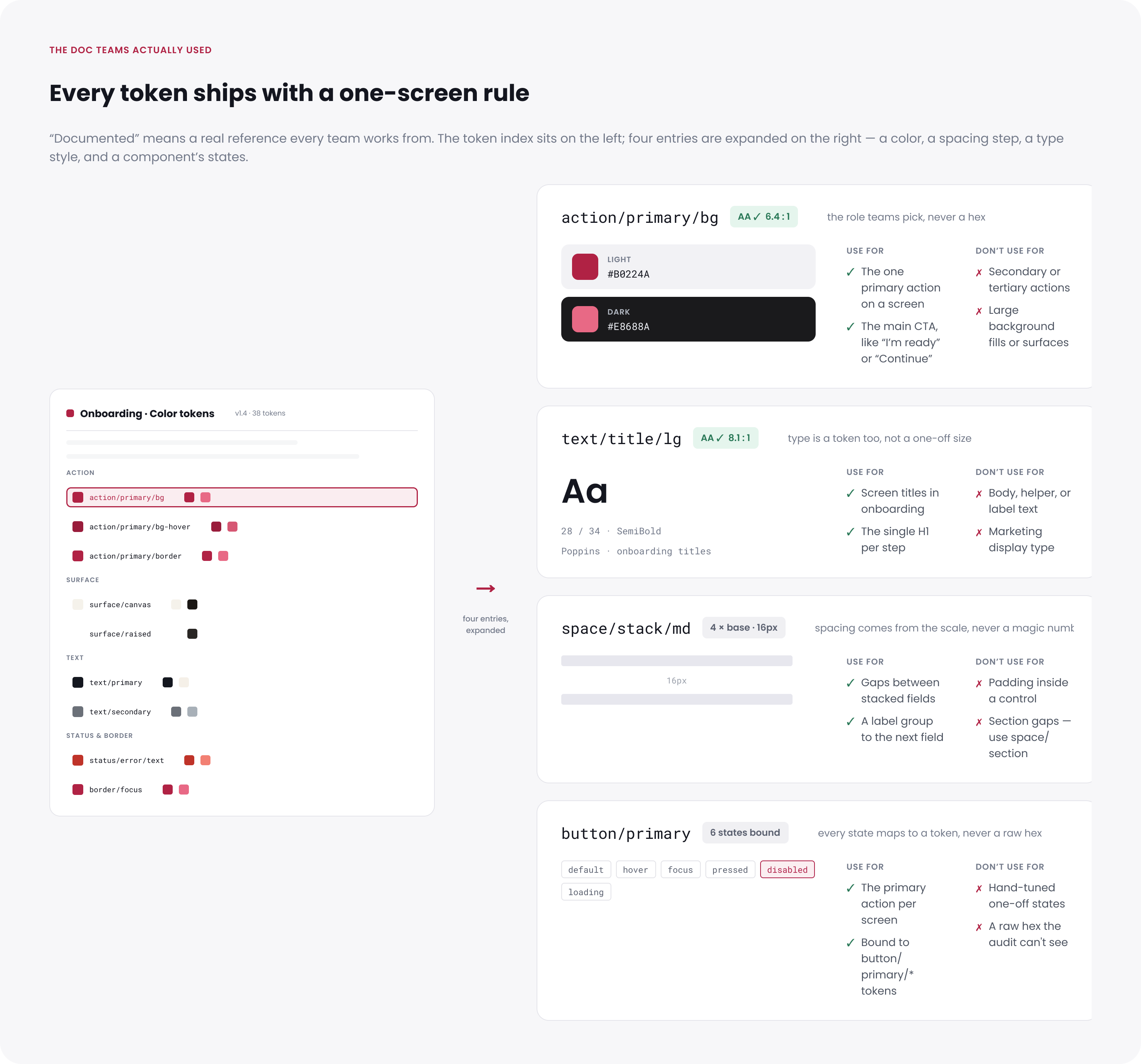
One documentation screen per token
Each token page explained its purpose, where to use it, where not to use it, the states it covered, and any contrast requirement. I considered the page finished when another squad could apply the token without asking me which value to choose.
The library needed a repeatable check
Documentation helped designers choose the right style, but it could not catch every mismatch. I considered a token complete when every supported theme had its own value or deliberately reused the base theme. Engineering automated that check and flagged missing theme values and one-off colors.
Primitive, semantic, and component tokens in the Tokens Studio JSON.
Every token checked across the supported themes.
Values chosen specifically for the active theme.
Values reused from the base theme.
No valid value in at least one reviewed theme.
Tokens pointing to a value that was not available.
A new onboarding screen was not ready for review if it introduced a hex value, spacing number, font size, or state that should have used the shared system.
Figma layers using a color value instead of a linked style. The token set could be complete while the screens still used old colors.
The automated report listed missing references and new one-off values. That gave design and engineering a shared list to fix instead of comparing screenshots and debating whether something looked off.
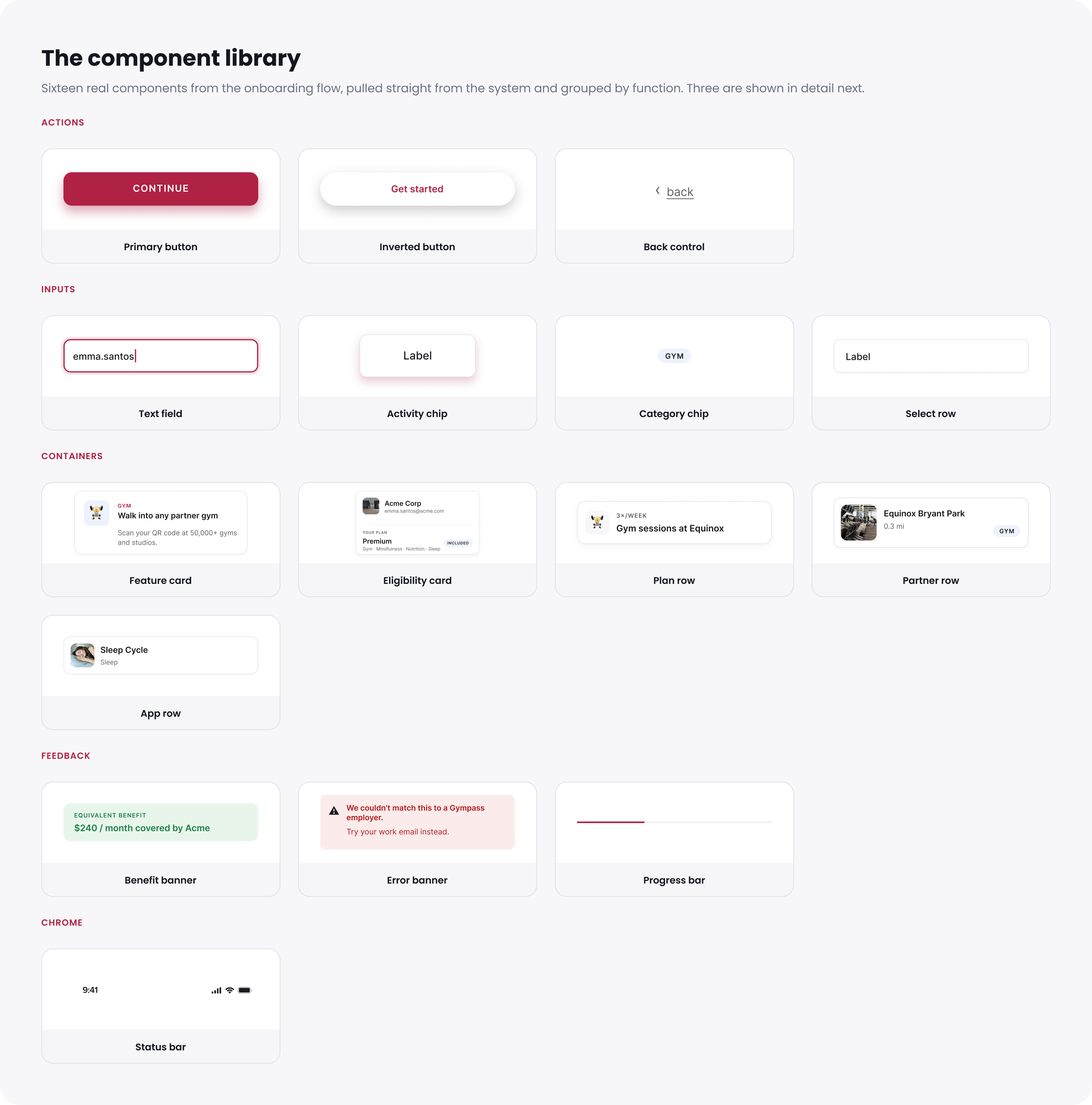
The component library
I started with the 16 components already used across onboarding. That gave every squad a reason to use the library immediately and avoided spending time on components nobody needed yet.
What stayed with engineering
The design system covered visual decisions and component structure. Keyboard handling, screen-reader labels, and interaction behavior stayed with engineering, who checked them in Storybook. I documented that boundary instead of treating Figma as the whole component.
Five squads switched to the corrected system while product work continued.
We introduced the updated library while the squads were still designing and building onboarding. I checked the flow in light and dark on iOS and Android, and the automated report flagged old color values in the screens we had reviewed.
Design and code used the same token name
A designer chose action/primary/bg in Figma. Engineering used the same name for web, iOS, and Android. I added a semantic token only when the app could use that name too, so the connection stayed clear across platforms.
The Figma token action/primary/bg appears on each platform as:
var(--action-primary-bg)light + [data-theme="dark"]Color("action/primary/bg")Asset catalog · Any + Dark@color/action_primary_bgvalues/ + values-night/Type, spacing, and component-state tokens followed the same naming structure.
The automated check flagged any reviewed onboarding screen that still used an old one-off value.
Starting with onboarding
I updated the React Native onboarding flow with engineering and checked it in light and dark on both mobile platforms. We turned on dark mode gradually while confirming that the light experience still matched. This brought the full onboarding flow into dark mode. Afterward, token changes went through design review and a Tokens Studio update before engineering added them to the app.
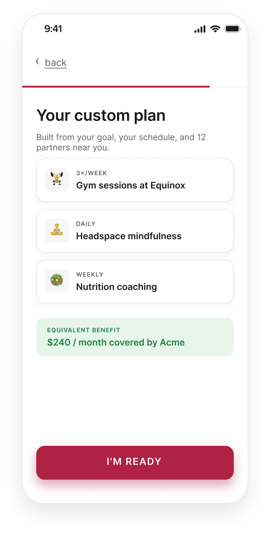
One squad had a good reason to push back.
Two sprints into the change, the squad behind the "Your custom plan" screen was close to launch. They said setting their dark colors directly would be faster than switching to the corrected library. For that sprint, they were right.
I stopped asking them to switch everything at once and updated their highest-traffic screen myself. I kept the old color names working so their existing designs did not break, and asked the engineer responsible for React Native onboarding to work through the change with me. That engineer later helped the next two squads update their screens.
We still missed one. A returning-member screen went live with a one-off color, and the scan found it a sprint later. That miss led to token review and the automated check. Using the shared library had to be easier than working around it, especially near a launch.
Dark-mode completion rose from 58% to 72%.
The gap with light mode fell from 16 percentage points to 2, and drop-off across all onboarding sessions fell about 18%. I cannot isolate a revenue effect from this work because sales, lifecycle, and retention changes happened alongside it. What I could verify was the design change: the reviewed onboarding flow no longer depended on one-off values or detached overrides, and new exceptions went through token review.
By the numbers
What I chose not to do
I narrowed the work in three places so it could move forward alongside active product work.
Web and other product areas moved to a later cycle. I documented the platform differences so the next team could reuse the review.
Five squads could update their screens on their own schedules, but the token set carried old and new names at the same time.
I did not turn every isolated value into a token. A smaller set was easier to understand and maintain.
What I’d do next
I would add a simple way to see which components teams actually use and rotate token review between squads. I would also extend the theme matrix to the next brand and accessibility mode. The review process should not depend on one designer seeing every request.